
10 Elements of Design
Design elements are universal. Whether you are an interior designer, graphic designer, architect, painter or anything else that involves some sort of creativity, you have probably considered some, if not all, of these elements of design.
What is design though? Is it simply lines, shapes, colors and organization? Whatever it is, it is easy to manipulate by changing even a minor detail.
Consider the following 10 elements of design if you are creating something new or need to find ways to revise a look.

1. Composition
Also referred to as layout. The overall, big picture. This is the overall visual organization and arrangement of all elements within a design.
One of the most subtle things I learned when designing that helped me – look at your work from a 10-25% view scale so the design is smaller. This allows you to see it from a distance and gain a new perspective of overall look. Good for paintings, print design, social media feed, etc.
2. Scale + Size
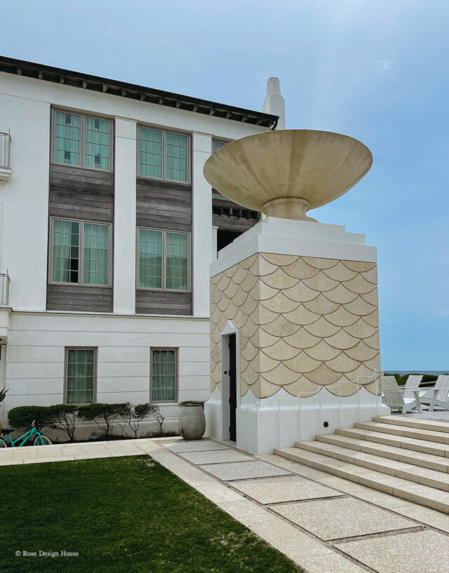
I went to Alys Beach and fell in love with the architecture. The exteriors were not complex, but the elements were prominent.
Oversized planters, giant doors, exaggerated architectural details….these features made the design.
Think outside of the box when it comes to sizing objects. Practicality isn’t always the best route.
3. Balance
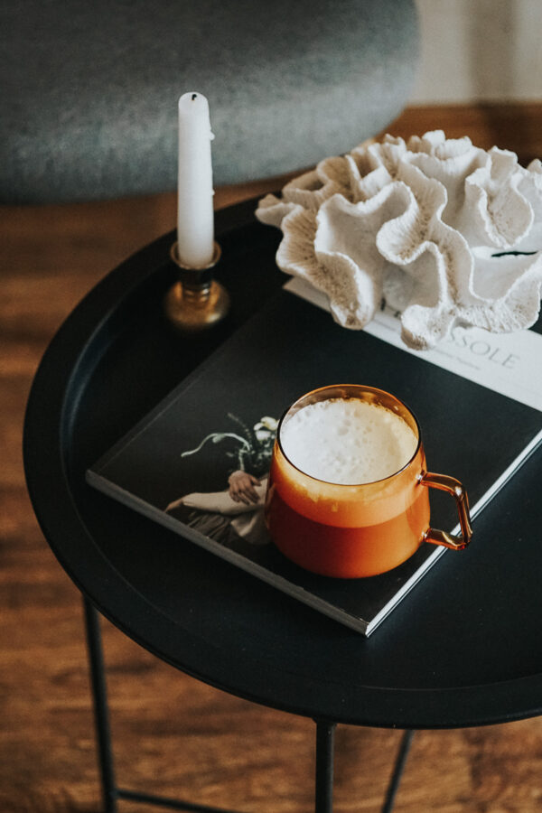
All things are countered by something else. Maybe you are a painter. If so, you realize there must be some sort of focal point with balancing elements.
If you are a designer styling a table, you agree there has to be some kind of balance to all of it. Another example would be floral arrangements.
As a creative of any type, you are the master craftsman of elements themself. What goes together?
Whether in scale, color or size, there is always a counterpart.
4. Alignment
Any editorial designer will tell you alignment can change the look of any design. Centered, left aligned, right aligned or justified text – each is totally different.
Think about elements within your design and where each element is in relation to the others.
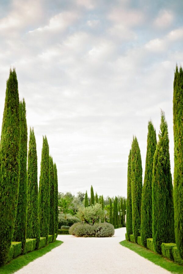
Consider a stately formal garden and the orderly fashion of rows of boxwoods. In this case, alignment creates order and a focal point.
5. Repetition
If you use too many different objects in any design, there is no unity. You must find ways to repeat items – maybe that’s a color, pattern, texture or other variable.
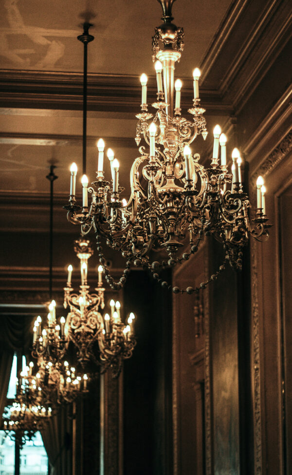
When I visited Charleston, I stayed at The Saint Hotel. In the foyer, they had these giant chandeliers. They were gorgeous, but the fact there were multiple ones hung together made the look.
Repetition ultimately brings looks together in a subtle way. This is especially true in interior design. Ordered chaos brings cohesive looks.
6. Contrast
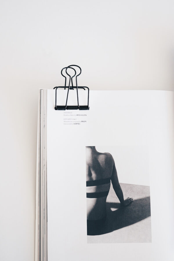
This is how you differentiate elements to create hierarchy.
Example: Headers, body text, sub headers, captions.
7. Negative space
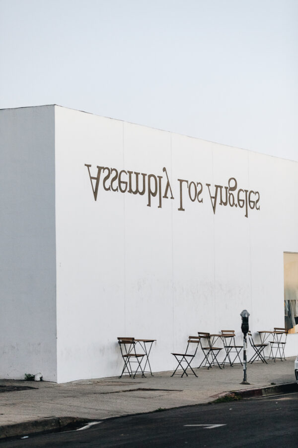
Also referred to as white space. Instead of trying to fill an entire space with something, let some space breathe. Busy designs (like older advertisements) can easily look dated.
White space is also a great way to add emphasis. When there’s nothing else to focus on, what are you focusing on? Less things to remember = More easily remembered.
So basically….how are you utilizing white space? Strictly for aesthetic or functionality or both?
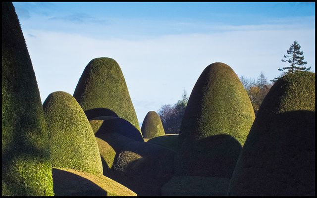
Chirk Castle Yew Topiary Garden near Wrexam
8. Symmetry + Asymmetry
Clean cut and organized symmetric designs vs asymmetry in design. Like everything else, there’s really no right or wrong answer.
Something to look at: landscaping. You can create a very organized scape with order and defined parts that mirror each other or you can create variation with different plants that are different heights and shapes. A flower bed, a boxwood garden, a neat row of trees….
Symmetry can be created with a mirrored layout and / or by using the same objects.

9. Color
Color establishes the mood of your overall design. Color psychology is something to consider when creating any marketing material.
Light and color are the initial language that begin in the eyes; therefore, it’s the ultimate first impression.
10. Texture
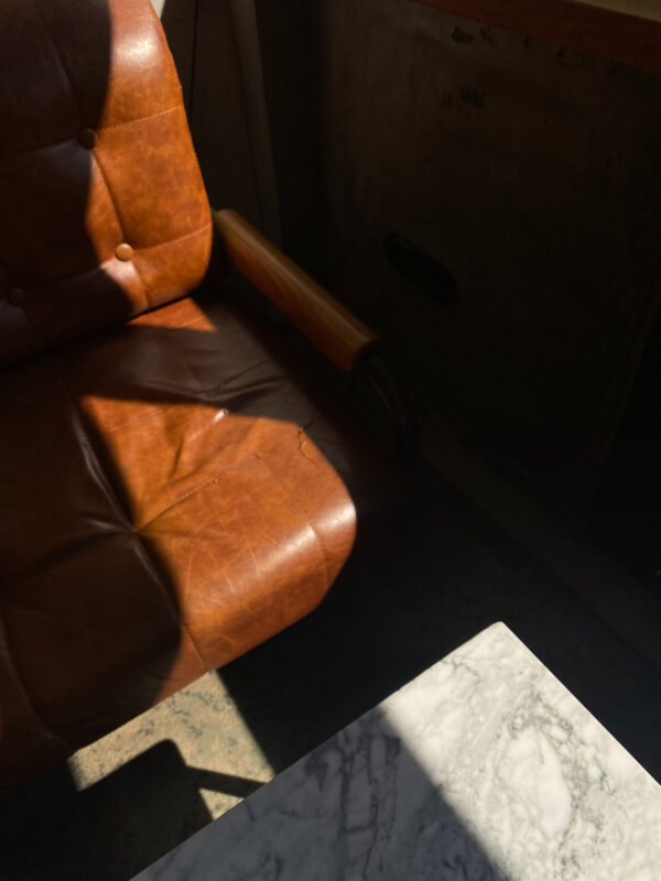
In 3D designs, texture creates depth. Oil paintings, textiles, materials, digital renderings, exteriors….textures drastically change the way any design looks and feels.
Smooth Italian leather feels a lot different than a jute rug. Texture alone can be the ultimate complementary companion in a space.


Leave a Reply